
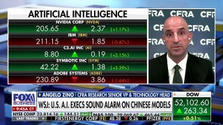


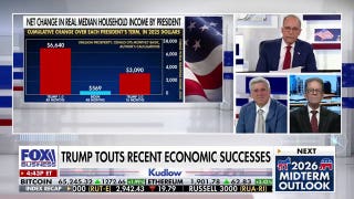

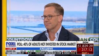

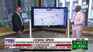


Parallels Between 1987 and Today – Should You Be Spooked?
The latest pullback in the markets may have you a little spooked, especially if you own small cap stocks (NYSEARCA:IWM) which are down almost 5% already in July. Year-to-date (YTD) small cap stocks (NYSEARCA:TZA) have also significantly underperformed, now flat for the year.
Is this just another short-term relief selloff that should be bought, or is a larger pullback brewing?
First, it’s important to recognize no large selloff has occurred without some sort of cracks forming in the markets’ shorter term foundations first. The short-term always breaks before the longer-term.
LISTEN: Chad Karnes gives his mid-year update on the Index Investing Show
Even the Monday, October 19, 1987 20.5% one day crash saw its previous three days already down a combined 10% as the month of October before the crash was already down 15%. The 1987 crash sent the entire October peak to trough move down over 35%. There was plenty of warning something negative was brewing, especially if technical analysis was being utilized.
Because of such risks there is always reason to keep an eye on what is going on in the short term, even if a 5% or even 10% pullback is acceptable for longer term investors. Such pullbacks can quickly turn into larger corrections, and that is always a risk.
Similarities Abound
There is no shortage of similarities between current market conditions and those just before other price peaks (1987 included). Many of these similarities we have pointed out to our subscribers, and they range from technical readings, statistical anomalies, fundamentals, or extremes in sentiment.
What’s important, though, is none of these similarities matter, not until the market changes its course from up to down. These similarities to all the other major market tops thus far haven’t reversed the market.
Price is what investors should ultimately care about, and that’s why we focus on key technical levels to keep us ahead of price movements.
Technical Similarities
Check out the first chart below showing the the S&P 500′s performance (NYSEARCA:SPY) just before the 1987 crash. Notice that trendlines helped warn when price momentum and thus the trend was ending?
Utilizing trendlines would have helped even the longest term investors get out before the bottom. Others keeping an eye on the shorter terms would have avoided the 20% crash altogether as they heeded the market’s warnings in early October.
A similar trendline strategy also warned of the 2000, 2007, and 2011 market tops.
Combining Trendlines with Indicators
Now check out the following chart similar to one I have provided our subscribers that shows the S&P (Nasdaq:VFINX) since 1990 overlaid with a popular momentum indicator.
Notice anything similar occurring today that also occurred at the recent major market peaks?
The red arrows show that the previous major market peaks occurred only after RSI reached overbought territory above 70%.
Today, the market has again reached these levels (shown by the red circle), but that doesn’t necessarily mean it’s time to sell. As can be seen in the graph, the late 90’s taught us that price can stay overbought and extreme for as long as a few years. 2007’s occurrence on the other hand provided a quicker end to the rally.
Currently, we are somewhere in between the two, overbought on a monthly basis, something that has accompanied every other major market peak.
As a result, the focus should be on preserving existing gains from the rally, instead of buying on the dip opportunities.
2011 versus 2014 – What to Watch
The following charts were also recently provided to our subscribers through our twice weekly published Technical Forecast and show a similarity between today’s market and that leading up to the more recent 2011 20% pullback.
Following up on an article found on our home page, ‘Dow Hits Key Milestone, Despite Slowing Growth’, the Dow (NYSEARCA:DIA) has risen 6,300+ points off its October 2011 low, but it has struggled of late, similar to what occurred during the 6,300 point move from the October 2009 low to the 2011 price high.
More importantly, once the 2011 price high was made, a break of a similar trendline strategy as shown in the 1987 example warned that the markets’ trend had changed and risks were increased for longs.
That slope trendline and breakdown in May 2011 is shown on the chart below. Following its suggestion, investors saved over 15% of losses suffered the Summer of 2011 as the markets in classical technical fashion backtested the broken trendline in July, providing one last exit opportunity.
I am watching for a similar breakdown in the Dow’s trendline off of the 2011 lows to warn of the next big market pullback. This is shown in the final chart below.
In addition to the trend similarities, the long term overbought reading shown in the S&P chart suggests the downside risk of such a break is also likely more than the 20% that occurred in 2011. 2011’s price never entered overbought territory like the year 2000 or 2007.
We already know that technically the market is long term overbought, just as it was at all the other major market peaks. We also know, as we have pointed out to our subscribers in a plethora of examples, that sentiment (NYSERCA:VXX) is historically bullish, also something that typically accompanies market tops.
Fundamentals also aren’t supporting the markets continued rise as GDP prints its largest negative reading since the 2009 recession and 2014 estimates are now again at under 2% growth (from a previously expected 4%+). Retailers (NYSEARCA:XRT) are also now finally admitting that 1Q’s slowdown was not weather related as sales rebounds have not occurred as expected.
All that is missing from the bearish puzzle is the technical price breakdown. Once that occurs the risks greatly increase the market’s (SNP:^GSPC) pullback will be of the larger variety as suggested by the fundamental, sentiment, and technical extremes already reached.
The ETF Profit Strategy Newsletter follows all the major asset classes with a focus on technical, sentiment, and fundamental analysis. We offer actionable trade setups individual investors can utilize through ETFs. Once the “bull/bear” trendline I have been following breaks down, it will be a major warning sign the markets may finally be ready to start their long awaited 20%+ pullback.