


Best Buy unveils new logo
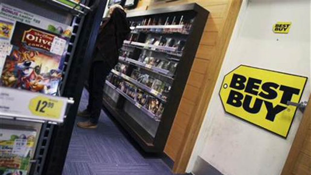
Best Buy unveiled a new logo on Wednesday, shrinking the yellow price tag that the electronics retailer had used for nearly three decades.
The updated logo displays the words “Best Buy” in a bold, black font, just as the previous version did. But the new design uses a much smaller version of the yellow price tag featured in the old logo.
“The updated logo is true to our heritage, but it’s really cleaned up,” Best Buy Chief Marketing Officer Whit Alexander said in a statement. “It’s an evolution toward the future, and we’re really excited about that.”
The new logo is part of an overhauled marketing strategy for Best Buy, which posted a 9% increase in same-store sales in its most recent fiscal quarter despite stiff competition from Amazon and other electronics retailers. The design will appear on Best Buy’s website, as well as in digital and TV ads. The chain said the new logo will eventually be visible on its employee uniforms and shopping bags.
Best Buy’s new ad campaign is set to debut on May 13, with commercials directed by Academy Award-winning documentary filmmaker Errol Morris.
Best Buy will next report earnings on May 24.