


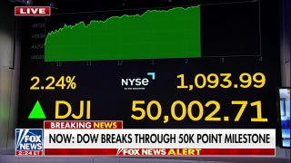


3 Charts That Should Change How You Think About Bank Stocks
I've made hundreds of charts over the last few years that convey one point or another about investing in bank stocks. Out of all of these, there are three that I've revisited time and again. Because each of them cuts to the heart of bank investing, I figured readers might benefit from seeing them in one place.
1. Banks fail all the timeThe first chart tracks annual bank failures in the United States since the Civil War, which was when our current bank system took shape. This chart illustrates the point that investing in banks isn't like investing in most other industries.
Thanks to high leverage, fractional reserve banking, and the unpredictable vicissitudes of the credit cycle, more than 17,000 banks have failed over the past 150 years. That equates to an average of 113 per year.
The net result is that most bank investors, absent intimate knowledge of the industry, should typically limit their investments in bank stocks to the nation's best-run lenders.
Two that come to mind are US Bancorp and Wells Fargo . These banks are efficient, sporting two of the bestefficiency ratios in the industry. They consistently write good loans, evidenced by their history of low loan losses. And they not only survived the latest crisis, but actually thrived as a result of it. Wells Fargo more than doubled in size following its 2008 acquisition of Wachovia.
2. The relationship between expenses and loan lossesThe second chart illustrates what may be the single most important relationship in all of banking: the relationship between a bank's efficiency ratio and its loan losses. Generally speaking, banks that spend a smaller share of their revenue on operating expenses also have a tendency to underwrite better loans. As I've noted before, there are two reasons for this.
The first is that both require discipline. If a bank has the discipline to keep expenses low -- which, based on my research, is rare -- then it seems natural that it would also have the discipline to manage credit risk shrewdly.
The second reason, which is a corollary of the first, is that inefficient banks appear to compensate for their inefficiency by taking on higher-yielding assets, which are also riskier. This allows them to generate profitability ratios in the short run that are comparable to their more efficient peers. But the downside to this approach is that, over the long run, it subjects the offending banks to potential failure when the credit cycle exacts its revenge.
Once again, US Bancorp and Wells Fargo serve as textbook examples of how to get this right. Both obsess over expenses. Wells Fargo's former chairman and CEO even refused to buy a Christmas tree for the bank's executive suite. And both have consistently lost less money on their loan portfolios compared with other lenders. These qualities go a long way toward explaining why these are two of the best-performing bank stocks of the past three decades.
3. The relationship between return on equity and valuationThe final chart illustrates the central relationship between a bank's return on equity and the valuation of its shares.
When evaluating whether to buy a bank stock, investors have been trained to look at the price-to-book-value ratio, which tells you how much the market believes a bank is worth relative to how much the bank itself claims to be worth. A commonly cited rule of thumb is to "buy at half and sell at two" -- meaning, more generally, to buy a bank stock when it's trading for a discount to book value and then to sell it once it's trading for a premium thereto.
The problem with this approach is that cheap bank stocks are typically cheap for a reason. Namely, they're cheap because they're less profitable than their better-heeled competitors.
As you can see, there's a strong correlation between the past 12 months' return on equity at the nation's biggest banks and the valuation of their shares. Bank of America, which generated a paltry 3.8% return on equity over the past four quarters, trades for a 22% discount to its book value. Meanwhile, US Bancorp and Wells Fargo, which have generated respective returns on equity of 14% and 15% over the same period, trade for 74% and 95% premiums to their book values, respectively.
The point here is that you get what you pay for. If you want a cheap bank stock, there are plenty to be had. But before investing your hard-earned money, take a good look at the first chart here -- the one about bank failures.
The article 3 Charts That Should Change How You Think About Bank Stocks originally appeared on Fool.com.
John Maxfield has no position in any stocks mentioned. The Motley Fool recommends Bank of America and Wells Fargo. The Motley Fool owns shares of Wells Fargo. Try any of our Foolish newsletter services free for 30 days. We Fools may not all hold the same opinions, but we all believe that considering a diverse range of insights makes us better investors. The Motley Fool has a disclosure policy.
Copyright 1995 - 2015 The Motley Fool, LLC. All rights reserved. The Motley Fool has a disclosure policy.