


Free Resources to Turn Your Data Into Graphics
Get graphic
Show-and-tell takes on new meaning in a digital world where data visualizations catch eyes and attention, engage viewers, inform while entertaining, and spur online sharing action at up to eight times the rate of all-text posts, according to research by Bit Rebels, the reporters of “everything considered geek.” To get in on the action by magnetizing your posts with one-of-a-kind infographics, start by putting the following free resources to work.
Turn words into art
Sites like Wordle make it easy to turn text into graphics. Just go to the site, click “Create,” and follow the prompts to “paste in a bunch of text” or enter the URL of a blog, blog feed or Web page with an Atom or RSS feed. Then click “Go” and within seconds you’ll see a cloud graphic with the most frequently used words presented in the most prominent type. From there, Wordle lets you customize the type font, layout and color scheme. When you’re happy with the graphic, print, save a screen shot or share the result.
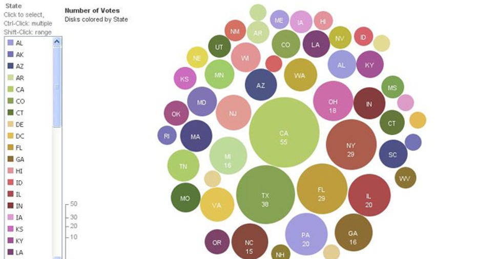
Convert data into visuals
An IBM experimental site, Many Eyes lets you generate comparative bubble or bar graphs, charts, word or tag clouds, maps and other data visualizations using your own data or data stored at the site. You choose the information you want to present and visual format you want to use. Then customize the graphic to suit your needs. When you’re done, click the “Share this” icon to post on Facebook or Twitter, or to grab provided code to embed a static image or live visualization on your site.
Get creative with PowerPoint
Leave it to the inbound marketing whizzes at HubSpot to come up with a downloadable, easy-to-customize solution for using PowerPoint to create your choice of step-by-step, informational, or data-packed infographics. Just download the free HubSpot template and follow the easy instructions to drop in your own copy, headlines and data and to change shading, colors, fills and styles. The result: You’ll transform your information into visuals worth sharing, tweeting, pinning, blogging and talking about.
Make a Google map
How about creating a map so people can locate the restaurants around the hotel you manage? Or the client businesses in your sales territory? In a short video, Deborah Potter of NewsLab leads you through the simple steps. You just open Google Docs, make a two-column spreadsheet with the names and addresses of the places you want to map, choose the map gadget, select your desired map options, create a title and generate your map. Use the provided HTML code to publish your map for online access.
Find and share established infographics
Visit Visual.ly and click “Explore” to tour an archive with thousands of infographics you can select, reference, share or embed on your own site. Or, create an account and then click “Create” to reach a series of visuals you can customize to visualize your own or others’ social media usage.
Customize chart and graphic templates
For super-easy creation of infographics, bar charts, pie charts, pictorial charts and line charts, visit Infogr.am. Sign in through Facebook or Twitter (no password required) and choose from a handful of templates. Once you settle on the visual you want to customize, simply click on each element and follow the prompts to enter your data. Then drag and drop elements to customize your visual. When you’re ready, click “Publish” and Infogr.am offers a link for online sharing and code for embedding the results on your website.
Want more?
Educator Larry Ferlazzo maintains a page on his educational blog that he rightly calls The Best Resources for Creating Infographics. In addition to the resources I’ve included in this slide show, he features a long lineup of links to pages for word clouds, mind maps, graphs, cartograms, map-making, diagrams, tutorials, “awesome tools” and compilations of infographics he considers the best of the best. You’re sure to find a tool to turn your information into a visual show-stopper.