10 Free Data Visualization Tools
While the paradigm of "more data is better" might look good from the executive suite, there's a challenge that many front-line business managers are encountering once they dig into this trove of new information: How to turn all those numbers into something useful. Data isn't worth much if you can't use it to affect your business decisions, and while spreadsheets have long served as an acceptable if mediocre way for rank-and-file business users to present data, the new data deluge is pushing this tool beyond its practicaly limits. What's needed is a way for everyday business people to build not only pleasing but informative data visualizations that they can present to their leadership and co-workers quickly and easily. While heavy-duty data analysis can still be the purview of hardcore business intelligence (BI) analysts, the ability to visualize large gobs of data in new ways needs to be democratized. And for small to midsized businesses (SMBs), the road to this new visualization vernacular needs to start with some free tools so they can touch, learn, and understand this new discipline before they have to invest in it.
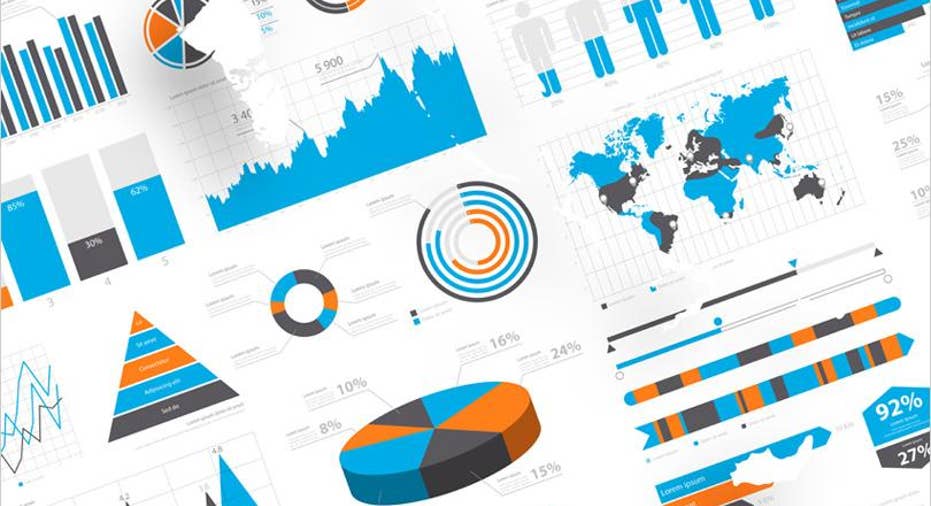
Before we go any further, let's understand what we're talking about here. The term "data visualization" doesn't necessarily refer to an arcane melding of SQL and PC graphics modeling. It's really just a general term that applies to any graphic that explains the significance of a new insight or data set visually rather than simply numerically. Technically, that simple pie chart you can one-click using Microsoft Excel is a data visualization. But, as technology has suddenly begun evolving in leaps and bounds over the traditional databases and spreadsheets to which we're accustomed, new kinds of data visualizations have become possible using a host of new tools and tech. And that's created a mystique around them that's kept many users from trying them, even though the basic tools to do so are already in their hands.
Even if you don't have access to one of the new breed of self-service BI tools that have fairly advanced data visualization baked in, you can still experiment with the concept because there are a host of third-party visualization tools available to anyone with a web browser. I've listed 10 of them below.
1. Tableau Public. This is right at the top because it's essentially the same platform as our self-service BI tool Editors' Choice winner Tableau Desktop . The company chose not to make its free version feature-poor. Instead, this is the full version of Tableau that's available for free download, with only one caveat: Everything you create with it is public, which means you'll automatically be making it available on the web via Tableau's visualization gallery.
2. Tableau Gallery. Tableau's gallery is cool enough to warrant a mention all its own because you don't need to download the tool nor use it to benefit from the gallery. Every visualization here can be downloaded into documents and email, or embedded into webpages with code snippets provided by Tableau. Other folks have done tremendous work on some truly impressive data visualizations and Tableau has curated that content and made it available for download. This is a great resource, not only for business people but also for researchers, students, and journalists looking for ways not just to flesh out and beautify their content but to keep it current, too.
Tableau Public
3. Microsoft Power BI. This is the last shameless plug for one of our reviews but I have to include it because, just like Tableau, Microsoft Power BI can be downloaded for free. And also just like Tableau, Microsoft has a visualization gallery that can be accessed by both Power BI users and folks simply looking for freely available visualizations.
4. Google Data Studio. Part of the Google Marketing platform, Google Data Studio aims to let users build multiple views of their data as well as dashboards rather than one-time, publication-ready visualizations. While it follows the Google tradition of requiring something of a learning curve, it's nevertheless not that difficult to use and it's also well-integrated with Google Analytics , which can make for quite a powerful pairing. Especially since both tools are available in free-to-play versions.
5. Openheatmap. This one purports to transform your spreadsheet, presumably encumbered with some kind of geographical data, into a functioning heat map with just one click. It works with Google Spreadsheets so you'll have to import your Microsoft Excel spreadsheet there if you want to use Openheatmap. But that's a relatively trivial requirement considering the possible results.
Openheatmap
6. Leaflet. This is definitely not a tool for complete newbies because it's just a JavaScript library that you'll need to incorporate into your data visualization framework on your own. But it's well-known because it's super lightweight (only 33 KB), and it's aces for building not just maps but interactive mapping visuals aimed specifically for mobile devices. That can be a tall order even for some of the commercial BI tools we've reviewed. So, if you're not scared of the command line or making an application programming interface (API) call, then check it out.
7. Datawrapper. Backed by a German company (Datawrapper GmbH), Datawrapper is nevertheless multi-national having been built by a team of developers, designers, and journalists from a number of European countries as well as the U.S. The tool is specifically built for jounralists looking to create fast, easily-digestible visualizations to accompany their articles, but it's useful for anyone requiring similiar data views. While there is a paid version that supports the company, there's also a free plan that tops out at 10,000 charts, which should keep many small to midsized business (SMB) operators happy for quite some time. The tools is entirely web-based and the site includes not only access mechanics, but also an Academy area where you can take online learning classes in how to use Datawrapper, and there's a gallery area, too, called the River, where users can upload data and their visualizations for sharing.
Datawrapper
8. Chartbuilder. This is a well-known chart-creation tool that was made publicly available by financial news website Quartz in 2013. Quartz had developed the tool in-house so its journalists could quickly render numerical data visually to make their stories stand out. Ironically, Chartbuilder isn't very pretty itself and also is not the easiest tool for rank beginners to use. You'll need to understand how to download the tool and activate a Python script to get it running.
But after that, it's simply a matter of cutting and pasting data into the tool (also not pretty but very easy), and then generating a graphic that you can tweak via the tool or via style sheets. The only downside to the tool (aside from a little upfront complexity) is that it doesn't generate interactive visualizations like most of the other tools on this list do. Chartbuilder creates only static charts, though these are very polished, as befits something intended to go from numbers to slick published content in just a few steps.
9. Information is beautiful. This is simply a growing library of striking, prebuilt visualizations that other people have created by using a variety of tools. The gallery is fun and everything is downloadable, though you'll need to pay attention to the licensing agreements. These agreements give free access to individuals (especially students and academics) but, if you're looking to use these visualizations for commercial work, you'll need to fork over some dough. Exactly how much depends on who you are and on an email exchange with the website's owner. Just to warn you: We asked to pay for a visualization for this story two weeks ago and still haven't heard back so, if fast turnaround is part of your agenda, look elsewhere.
10. Open Refine. There's an oft-overlooked underpinning to a successful data visualization: data transformation. That's especially true today when Big Data is trying to provide insights across different data sources, maybe a spreadsheet, maybe a long transaction log gleaned from a machine learning (ML) algorithm.
Transforming data generally refers to the painful (for normal people) process of taking a whole bunch of disparate numbers and turning them into a sleek set of relatable data. That means cleaning data (formatting and error checking), transforming it (changing from one format such as native Microsoft Excel to another, such as XML), and then making it available to external services such as webpages and those BI tools you're using. If you're thinking this can be a painstaking, eye-watering, brain-bending task, then you'd be right…unless you use a data transformation tool such as Open Refine. This tool began life under Google's flag but was rebranded to stand on its own. It's still both free and easy to use so, if you're banging your head against a mountain of mismatched data, check it out.
This article originally appeared on PCMag.com.